Internship at What the Flux
BRANDING PROJECTS:
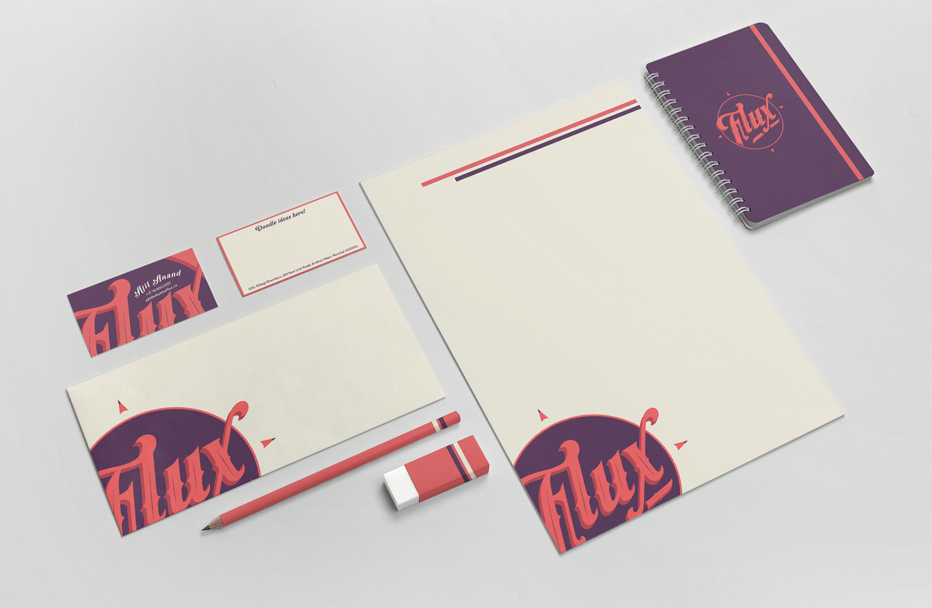
What the Flux is a start up Idea Design company, who want to make big or small changes through creativity and innovative designs. The CONCEPT for the branding was based on a compass, to reflect that the idea that they could be steered in the direction required by the project/ client (the pencil tips to indicate the four directions.) The innovative business card transcends boundaries and is more than a commercial business card. It would contain matchsticks and the back side would be blank for people to doodle ideas. Since several people in the creative industry in Mumbai indulge in smoking, they would keep the business cards with them and also use it to jot down their ideas. As the word, 'Flux' means constant change, the colours of the brand would be changed occasionally, leaving the brand identity constant.
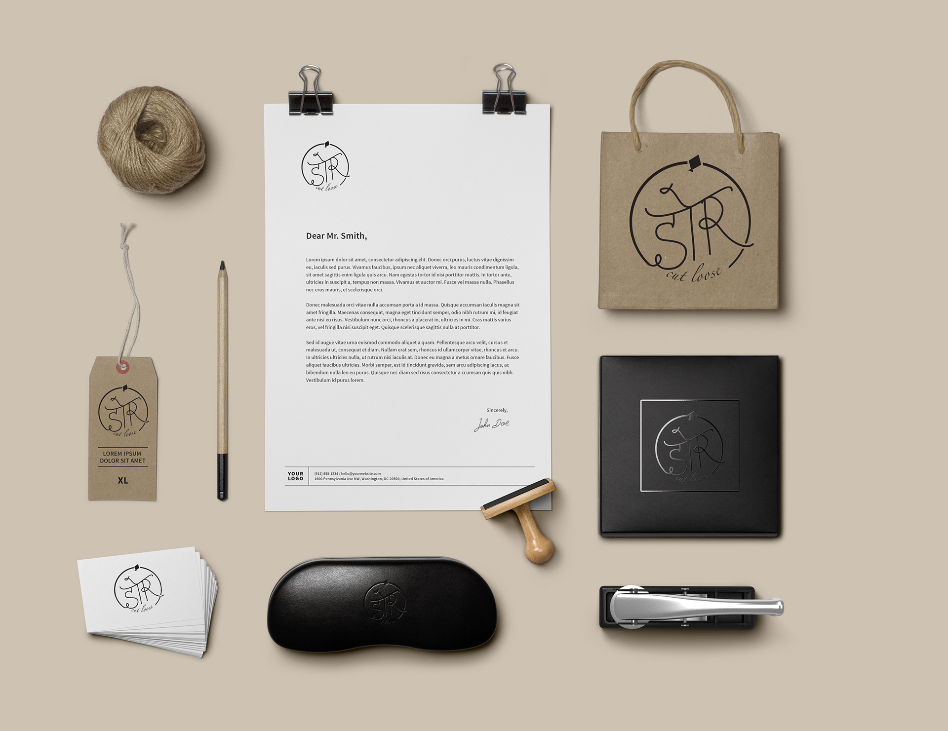
Brand Identity for a new Women's Indo-Western clothing company. The logo depicts, Dor means thread in Hindi and on a closer look, soar in English. The CONCEPT for the logo emerged from the idea of encouraging Indian women to 'cut loose' from the threads (dor) holding them back and soar high to accomplish their dreams and aspirations. The little kite is used to symbolise the target audience: 25-30-year old women in tier two and tier three cities in India.
WEBSITE DESIGN:
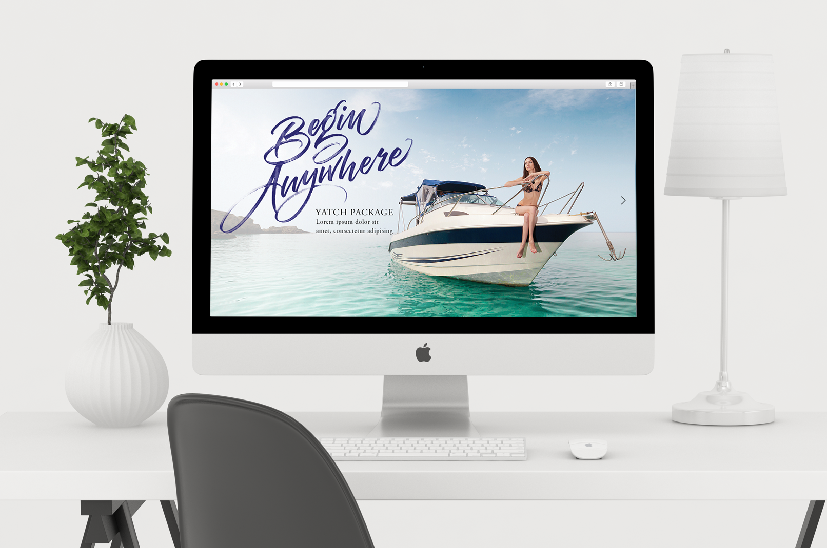
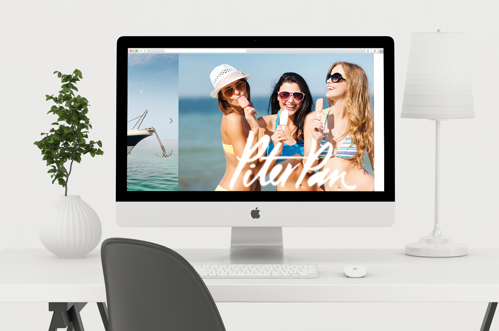
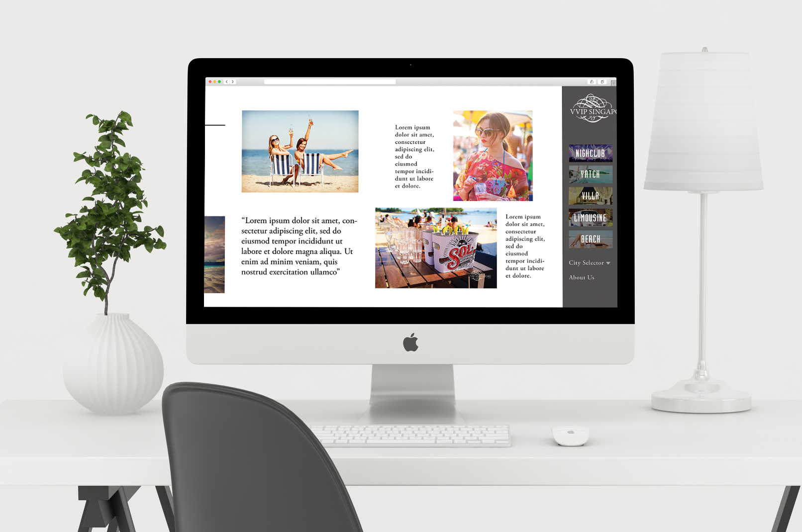
Web design project for a company that organising party services in Singapore. We started with making different versions of a wireframe (designing the user experience) with the minimum number of clicks required and then developed the user interface or the visual aesthetic of the website. Photography and dynamic typography were two key elements that would bring the party atmosphere to life through the website. Breaking conventional ways of how a website is designed, this site would have a horizontal scroll as shown in the following images (mockups of what the website would look like.)